Brand Guidelines for Kyle

The purpose of brand guidelines are to ensure consistent and standardized use of our logos, brand colors, and other visual assets.
We have three main tools in our external branding: our logo, our fonts, and our colors.
Our Logo
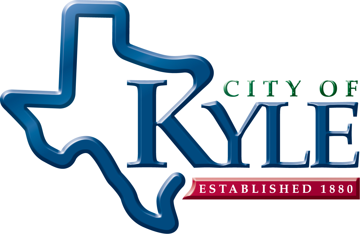
We have five variations of our logo, with different applications.
![]()
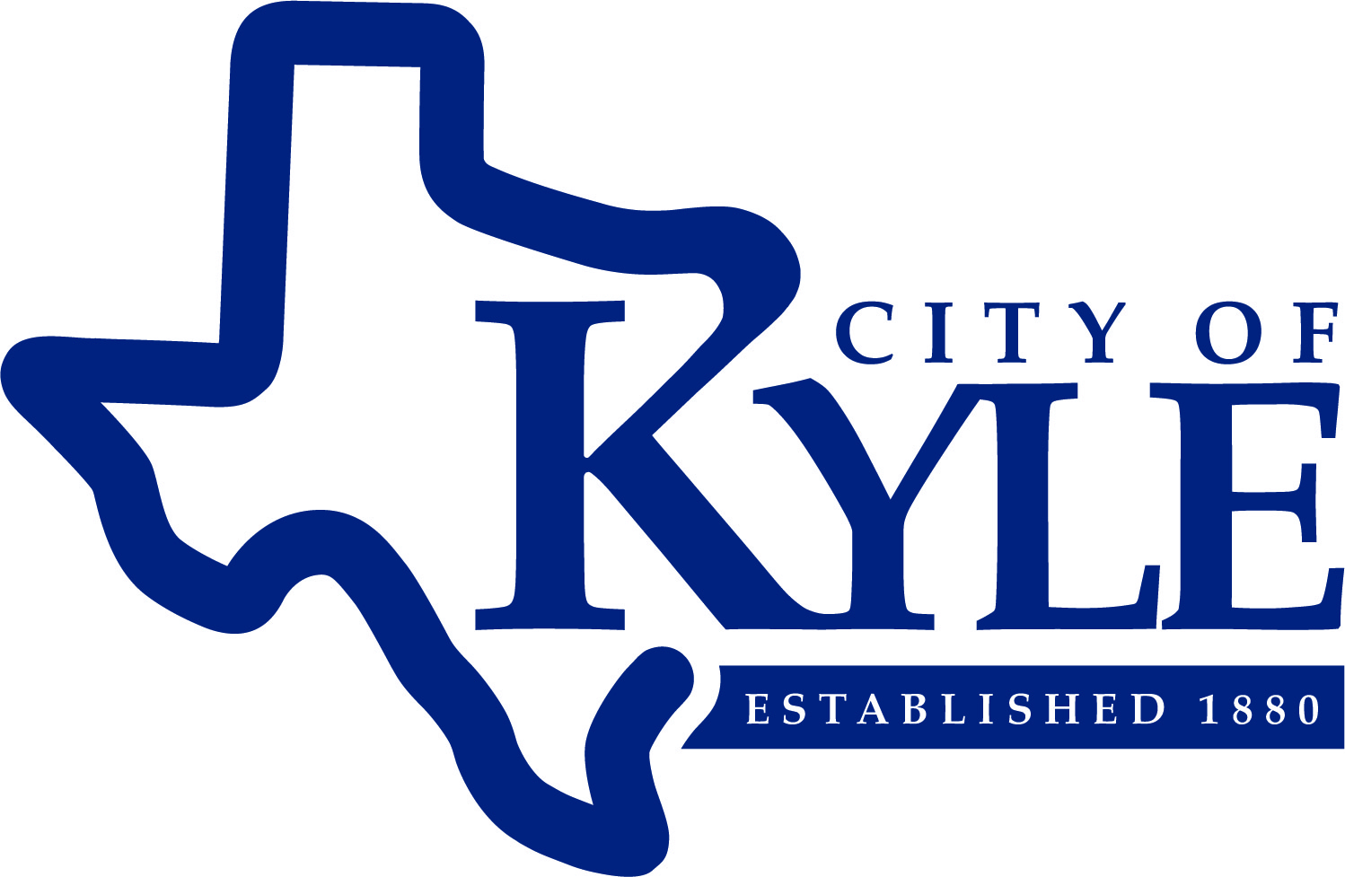
Our full gradient logo is the logo used most frequently in print and digital applications.
Do not use this logo if the mark is going to be less than 1.5 inches wide, as the gradient can affect readability at smaller sizes.
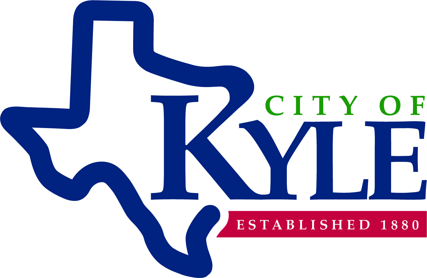
![]()
Our flat color logo is for any small applications where you wouldn’t be able to see the gradient, or anywhere it makes sense to have a bit more subtle logo.
![]()
Our flat blue logo uses our brand blue across the entire logo and is for special print applications where we may be limited on the number of colors we can print.
![]()
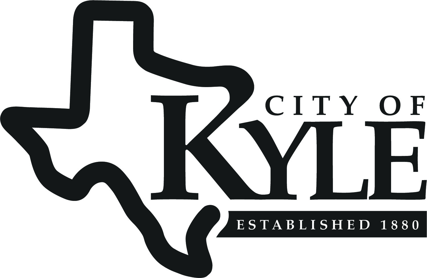
Our black logo is for places we’re limited on the colors we can use, like newspapers and other black and white color applications.
![]()
Our white logo is for when you have a dark background that you need the logo on.
Logo Whitespace
The whitespace is the space you should keep clear around the logo. When you are trying to space out the logo, first look at the size it will be on the final product. Once you have that size, look at the “E” in Kyle. The whitespace around the logo should be about the height of that “E” and should be applied to all sides.
Our Colors
Our brand consists of four colors: blue, green, red and yellow. Blue is our primary color, with green, red, and yellow secondary.
|
Blue |
Green Pantone: 356C Hex: #007A33 RGB: 0-122-51 CMYK: 91-0-100-26 |
| Red Pantone: 193C Hex: #BF0D3E RGB: 191-13-62 CMYK: 0-100-59-11 |
Yellow ♦♦♦ Pantone: 116C Hex: #FFCD00 RGB: 255-205-0 CMYK: 0-10-98-0 |
| Not-Quite Black Pantone: 419C Hex: #212322 RGB: 33-35-34 CMYK: 76-65-66-90 |
Our Fonts
We understand many people may not have the exact fonts we use, so if you don't have them we ask that no decorative fonts are used for our branding and font choices match closely to our brand fonts.
Our headline font is Mrs. Eaves XL Serif Bold, a heavy serif font, and our body text font is Monserrat, a sans serif font.
Great alternatives that are more accessible than these fonts are:
Serif Options
Baskerville
Palatino
Sans Serif Options
Century Gothic
Proxima Nova
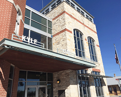
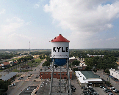
Photography & Imagery
Local photography is preferred, stock photography is discouraged. Below are examples of the types of photography we recommend using.


Below are high-quality JPEG files of our logo. Please use these for print and digital applications of our logo.
For any additional logo formats or imagery, please email communications@cityofkyle.com


